
Before

After

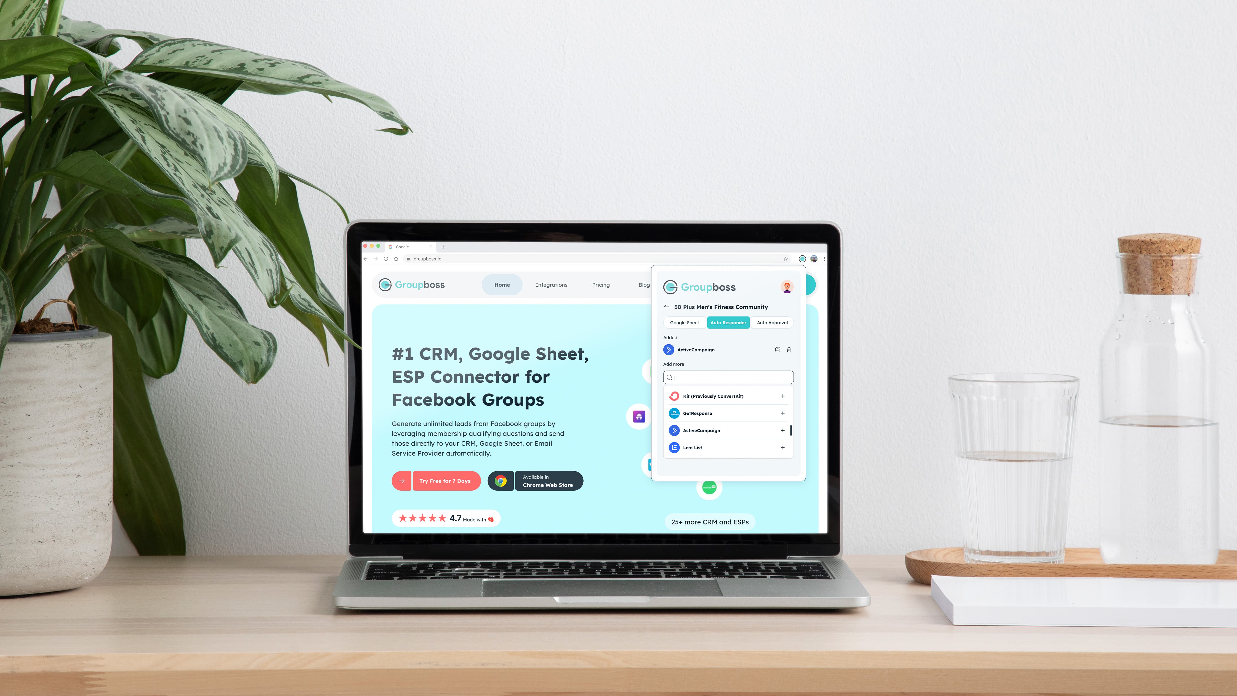
Groupboss is a powerful Chrome Extension designed to turn Facebook Group engagement into actionable business leads. It serves as a vital bridge between social community management and professional marketing funnels.
Extention URL
The Problems
Community managers and coaches lose hours manually copying member data (answers to questions, emails) before approving requests. This process is prone to error and creates a massive barrier to effective lead nurturing.
The Solution
Groupboss automates this workflow directly within the Facebook interface. With a single click, it captures and syncs member data to Google Sheets and 20+ major CRM/Email platforms.
My Role : Leading Design Process
As the Lead Designer, I spearheaded the end-to-end redesign of the Groupboss Chrome Extension. Working under an accelerated timeline, I moved the product from "clunky utility" to a high-performance and elegant chrome machine.
Strategic Overhaul: I defined a new visual identity that balances Material Design precision with a premium, modern aesthetic.
Systematic Problem Solving: I conducted a deep-dive audit to identify and eliminate legacy UI bottlenecks, transforming "data overload" into clean, scannable interfaces.
Applying UX Science: I didn't just move pixels; I leveraged a suite of UX laws like (Hick’s, Jakob’s, Zeigarnik Effect, and Fitts’s) to simplify complex lead-capture flows, making the tool feel intuitive from the first click.
Bridging Gap: I led cross-functional sessions with the product and engineering teams to ensure our design was technically scalable and perfectly aligned with business growth goals.
The Audit: Identifying Critical Friction
Through a rigorous Heuristic Evaluation and UX Audit, I uncovered several deep-seated issues that were hindering growth:
Accessibility & Compliance: The interface was non-compliant with WCAG 2.0 standards, featuring poor color contrast and "invisible" functional signifiers.
High Cognitive Load: A lack of visual hierarchy forced users to expend extra mental effort, significantly increasing the interaction cost.
Ambiguous Interactive Elements: Confusing tabs, inconsistent CTAs, and "disabled-looking" input fields led to user hesitation and unnecessary clicks.
Visual Debt: A disjointed color palette and unprofessional structure created a low-trust environment, making the tool feel "unreliable" for handling sensitive lead data.
I focused on four critical pillars to align design with business goals:
Business Goals: Increasing user retention by reducing the tool's perceived complexity.
User Pain Points: Identifying "Data Anxiety", users feared losing leads due to the cluttered interface.
Market Gaps: Moving Groupboss from a "basic utility" to a "premium lead-gen partner."
Technical Feasibility: Ensuring the Material Design implementation was scalable for the engineering team.


With the audit findings as my roadmap, I moved into a rapid ideation phase. My goal was simple: transform a "heavy" utility into a frictionless experience that feels intuitive from the very first click.
Strategic Sketching: I blended traditional "pen-and-paper" wireframing with AI-assisted prototyping to quickly explore layouts that prioritize Law of Prägnanz (simplicity and order). This allowed me to test how information could be "chunked" to follow Miller’s Law, preventing user overwhelm.
Component Evolution: I didn't just pick a tab style; I prototyped multiple navigation patterns against industry standards, eventually selecting the one that most effectively reduced interaction cost for multi-tasking community managers.
Inclusive Visual Logic: To solve the accessibility gaps, I iterated on a high-contrast palette and typographic scale that satisfies WCAG guidelines, ensuring the UI remains readable for users with visual impairments.
Feedback Loop: I facilitated "huddles" with Sales, Marketing, and Engineering to ensure my solutions weren't just "pretty," but also solved for growth gaps and technical feasibility.

The Visual Strategy:
Emotional Design & Aesthetics: Following Emotional Design principles, I focused on a premium, highly aesthetic look. When a UI feels high-end, users naturally develop a higher level of trust and "pride of ownership," making them more likely to stick with the product long-term.
Systemic Consistency: I implemented a unified Component Library. This ensured that whether a user is in the Chrome Extension popup or deep within the dashboard, the buttons, inputs, and feedback loops feel identical, drastically reducing the learning curve.
Refined Typography & Hierarchy: I prioritized a high-legibility typographic scale and intentional white space. By utilizing clear font weights, I established a Visual Hierarchy that guides the user’s eye to the most critical data points first.
Color Psychology & Feedback: I curated a "High-Contrast, Low-Strain" palette. Success and Action states were strategically placed to be instantly scannable, giving users immediate visual confirmation that their automation is working correctly.
Data Density Management: To solve the "Data Overload" problem, I redesigned member cards and tables with generous "breathing space" and logical chunking. This transformed a cluttered list into an easily digestible and understandable interface.

The Legacy Interface: High Cognitive Friction
The original onboarding experience suffered from several critical usability issues that hindered user adoption:
Accessibility Failures: The color palette failed to meet WCAG 2.1 accessibility standards, leading to poor legibility and visibility issues for many users.
Lack of Structure: The interface lacked a formal design system, feeling more like a "generic notepad" than a professional B2B tool. This lack of visual cues made the setup process feel manual and unguided.

The New Improved Design: Intentional User Flow
I redesigned the onboarding experience with a focus on Time-to-Value (TTV) and brand trust:
Information Clustering: I applied Information Architecture (IA) principles to cluster setup steps, making a complex automation process feel manageable and intuitive.
Inclusive Design: Developed a high-contrast color system that meets WCAG accessibility guidelines while strictly adhering to the new, premium brand identity.
Cognitive Breathing Space: By implementing generous white space and a clear typographic scale, I eliminated the "cramped" feeling of the legacy UI, allowing users to focus on one action at a time.

Legacy Interface: Breaking Mental Models
The original integration screen suffered from "Visual Noise" and non-standard patterns that created significant friction:
Confusing Tab Logic: The "Deselected" state used a heavy brand color while the "Active" state was black. This inverted the user's mental model, making it unclear which integration was currently active.
Misplaced Hierarchy (Jakob’s Law): The "Back" button was styled as a primary Call to Action (CTA). According to Jakob’s Law, users expect "Back" to be a secondary navigational element, not a primary action.
Accessibility & Priority: Essential actions like "Disable" and "View Sheet" were visually unbalanced. The low-contrast text failed WCAG accessibility standards, making the critical "View Sheet" link nearly invisible.

New Improved Design: Contextual Clarity
I restructured integration UI to prioritize functional hierarchy and user confidence:
Interactive Tab States: Redesigned tab system with clear visual cues for active vs. inactive states. The "Selected" state now clearly anchors user within their current workflow.
Meaningful Action Hierarchy:
Primary Action: The "Disable" button now uses a meaningful, high-visibility state that reflects the gravity of the action.
Secondary Action: The "View Sheet" link was promoted to a consistent secondary button style, increasing discoverability and matching brand guidelines.
Standardized Navigation: Relocated and restyled the "Back" button as a standard navigational element.
Inclusive Contrast: All typography and interface elements now meet strict AA/AAA color contrast guidelines, ensuring the tool is usable for everyone in any lighting condition.


The Legacy Interface: High Interaction Cost
The original auto-responder setup was a "black box" for users. It failed several core usability principles:
Heuristic Violation (Recognition vs. Recall): By hiding all 20+ integration options inside a closed dropdown, the UI forced users to recall if their tool was supported rather than allowing them to recognize it instantly.
Input Ambiguity: The form fields lacked visual distinction between titles, placeholders, and active states. This made the inputs appear "disabled" or inactive, leading to user hesitation.
Low Information Density: The lack of accessible text contrast made the setup instructions difficult to read, increasing the risk of configuration errors.


New Improved Design: Reducing Interaction Cost
I transformed the setup process into a transparent, two-step guided workflow:
"Open-List" Paradigm: Based on Nielsen’s Heuristics, I replaced the hidden dropdown with an open, categorized list of automation tools. This allows users to see all available options at a glance, significantly reducing the interaction cost and time spent searching.
High-Fidelity Form Design:
State Awareness: I introduced clear visual hierarchies for input fields, including distinct Active, Hover, and Error states.
Floating Labels: Using Material Design patterns, I ensured that field titles remain visible even after a user begins typing, maintaining context throughout the process.
Contextual Support: I integrated a prominent "Help" button directly into the sync form. This provides immediate assistance at the exact moment a user might feel confused, preventing drop-offs during the integration phase.

Legacy Interface: Input Friction & High Interaction Cost
The original auto-approval page suffered from "input rigidity," forcing users into a single, inefficient way of interacting with data:
Restricted Input Logic: The approval timer was limited to keyboard-only entry. In a modern UI, users expect multi-modal input (both mouse/stepper and keyboard) to choose method that is fastest for their current workflow.
Hidden Simple Data (Dropdown Overuse): With only three gender categories, hiding these options inside a dropdown created an unnecessary click. This is a common UI mistake that slows down user's "scanning" process.
Visual Debt & Accessibility: Cluttered information and poor color contrast made the settings feel overwhelming, leading to a higher chance of user error during setup.

Improved Design: Effortless Configuration
I redesigned settings page to be lean, accessible, and inclusive, focusing on reducing time it takes to "set and forget" automation:
Hybrid Input Freedom: The timer now supports both keyboard entry and mouse-friendly stepper controls, accommodating different user preferences and improving overall User Control and Freedom.
Zero-Click Selection: I replaced the gender dropdown with Open Radio Buttons. By exposing these options, I eliminated a click and made form instantly scannable, adhering to the principle of "Direct Manipulation."
Left-Aligned Information Clustering: By moving to a consistent, left-aligned layout, I created a clear F-Pattern scanning path. This ensures that label and input are always logically connected, reducing eye strain.
Aesthetic Consistency: Final UI is fully integrated into Material Design system, ensuring that even "boring" settings pages feel premium and professional.
This redesign didn't just update pixels; it transformed Groupboss from a "basic browser utility" into a high-performance engine that users, and business, can rely on.
Driving User Retention: I bridged gap between complex automation and business growth by reducing "perceived complexity," helping turn users into long-term customers.
Reduced Interaction Cost: By simplifying lead-capture steps, I eliminated "Data Anxiety," allowing community managers to collect Facebook group leads with speed and total confidence.
Built Brand Trust: I replaced legacy "visual debt" with a premium, modern aesthetic using UX & Emotional Design principles to match the power of automation.
2x Faster Engineering: I delivered a structured Material UI Kit as a single source of truth, enabling dev team to ship new features twice as fast without breaking design.
Lessons Learned:
Design as a Business Lever: I learned that reducing "Data Anxiety" is a direct path to user retention. By building a high-trust interface, I turned a technical tool into a reliable business partner.
Speed via Strategy: Working on an accelerated timeline proved that Heuristic Evaluations are a "cheat code" for quality. Relying on UX Laws allowed me to skip guesswork and ship a premium product faster.
Developer Partnership: Delivering a Material UI Kit wasn't just about handoff; it was about efficiency. I learned that best designs are the ones that help engineers ship 2x faster without losing visual integrity.
Platform Discipline: Designing for Facebook ecosystem taught me to respect third-party constraints while still creating a distinct, professional identity that stands out.


